8 minutes
Despite the explosion of digital delivery, physical branches remain not only relevant but also essential.
Even in today’s world filled with digital financial services, in-person branches still are a way for credit unions to connect with members, fortify loyalty and showcase their brands. Leaders are revitalizing these once-conventional spaces, creating member gathering spots and community hubs. Urban renewal, historical context and state-of-the-art technology are heavy influencers. There’s no single right answer in branch design, and each of these facilities is as different as the CU itself.
Fab Facility No. 1
 Andigo Credit Union
Making Its Brand Pop
Location: Schaumburg, Ill.
Builder: La Macchia Group, a CUES Supplier member based in Milwaukee
Completion date: August 2017
Square footage: 3,842
Employees: 9
Why Is This Branch Special?
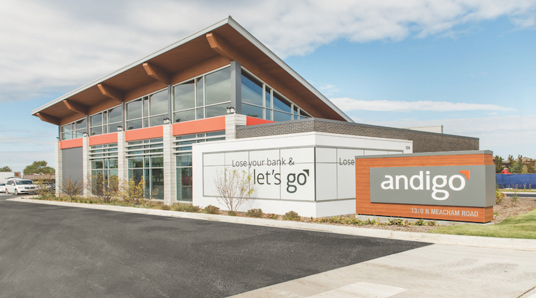
Andigo CU’s fresh, playful brand was the inspiration. The design focuses on the unexpected, using unique finishes, pops of branded color and dynamic details.
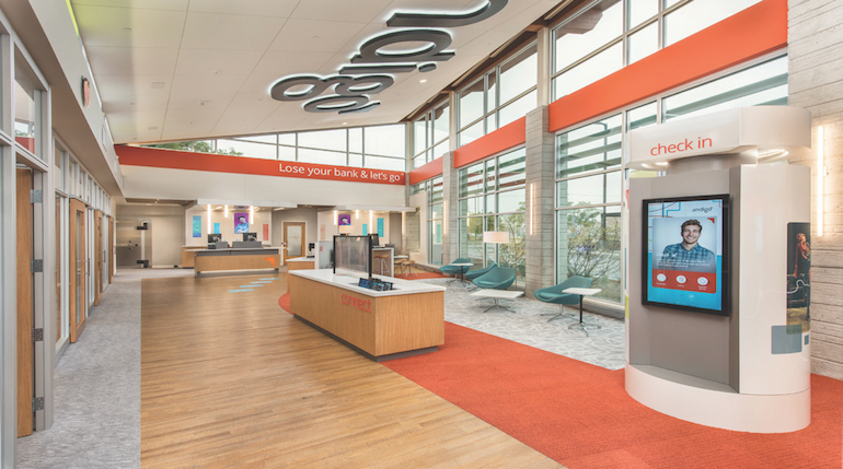
From the moment you walk in the door, you realize you’re in a space that houses the next generation of banking; it’s not your typical branch. Members are comfortable carrying iPads throughout, making appointments at touchscreen monitors while enjoying entertainment via a translucent monitor, which allows users to view what is shown on the screen while still being able to see through it. $873 million Andigo CU wanted to wow members with technology and branding, and it delivered.
 Most Unique Feature
Not just one, but a combination of details tells the story, from the video wall behind the tellers to the arresting shape of the building to the huge logo on the ceiling that is visible through windows high in the walls, essentially becoming a billboard visible from across the street—especially when lit at night.
Key Considerations
Andigo CU partnered with La Macchia Group to perform a strategic analysis. After evaluating the CU’s market position, the firm provided a strategic plan to support future growth and identified a well-trafficked location in Schaumburg, Ill.
Wow factors
- At the Connect Station, members work together with staff to complete transactions on iPads in a personalized experience.
- The Kids’ Play Zone provides an iPad and a monitor so kids can play financial literacy games and participate in monthly coloring contents.
- Teller pods create a retail environment, operating as a traditional teller line with a more engaging experience.
- Digital canopies cover the teller pods, a wayfinding element members recognize upon entering.
Remarkable branding
- The oversized logo on the ceiling that becomes a lit billboard at night when seen through the location’s high windows takes branding to a new level.
- From the custom-branded carpet to the “Andigo orange” wall covering, with brand elements infused throughout the lobby for an immersive branding experience.
Fab Facility No. 2
 Harvard University Employees Credit Union
Embracing Historic Harvard Square
Location: Harvard Square, Cambridge, Mass.
Builder: DEI, Inc., Cincinnati
Completion date: August 2015
Square footage: 3,850
Employees: 8-11
Why Is This Branch Special?
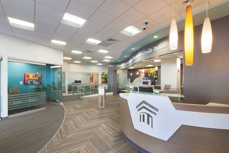
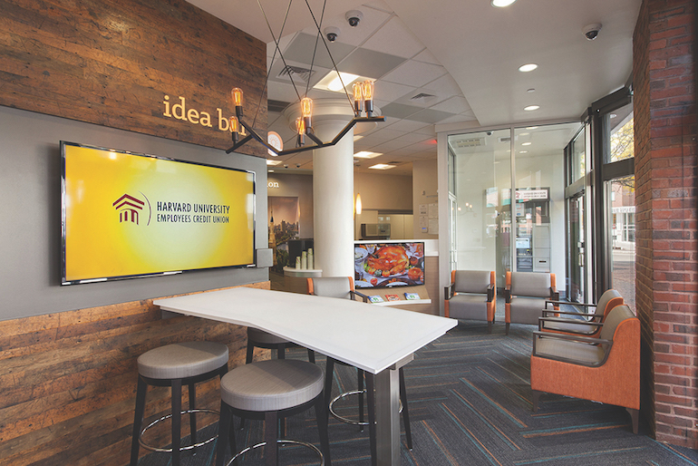
Located in the prestigious and historic Harvard Square, the branch brings together technology, interactive hubs, and a combination of new and reclaimed materials. While navigating the branch, every touch point is designed to market to and delight the member, including video screens featuring products and services, brand colors and local artwork.
Most Unique Feature
The curved face of the lease-space building and multiple floor elevations led to a unique floor plan. DEI’s architect overcame the fragmented overall nature of the existing space while fitting the offices into the oddly shaped footprint.
$627 million Harvard University ECU granted the designers leeway in creating the vision for the branch. The outcome? An impressive space with modern rustic flare that included exposing the existing brick and reclaimed wood flooring repurposed on an accent wall. An old vault room was also transformed into a small conference area.
Dialing into the members’ demand for technology, a lobby wall of four TVs allows for multiple inputs and configurations, and showcases current products and news. DEI also designed an “Idea Bar” with a wall-mounted Smart TV and custom countertop with iPads at each station. Today, the CU uses the Idea Bar to train employees and as a tech access point for members.
 Key Considerations
- An accelerated construction timeline was challenging; crews worked overtime to accommodate the tight schedule, completing the project in 74 days.
- An aesthetic glass panel and metal railing were implemented to overcome the uneven flooring and provide ramps to office spaces compliant with the Americans With Disabilities Act.
- Technology areas and conference rooms were placed in visible nooks to maximize space and provide amenities.
- DEI worked with a group called Art Lifting, Boston, for the artwork. This organization helps artists who are homeless or disabled sell their works across the country.
Cost Factors
DEI was required to use union labor at approximately a 40 percent premium. Unexpected costs included a poor subfloor, which needed to be prepped before flooring was installed. The City of Cambridge was particular about construction inspections, adding to the permit fee costs and triggering additional meetings to review the proposed exterior signage, etc.
Fab Facility No. 3
 Verity Credit Union
Creating the Veritable Conversation Place
Location: Ballard neighborhood in Seattle
Builder: Momentum, Inc., a CUES Supplier member in Seattle
Completion date: November 2015
Square footage: 2,500
Employees: 4-6
Why Is This Branch Special?
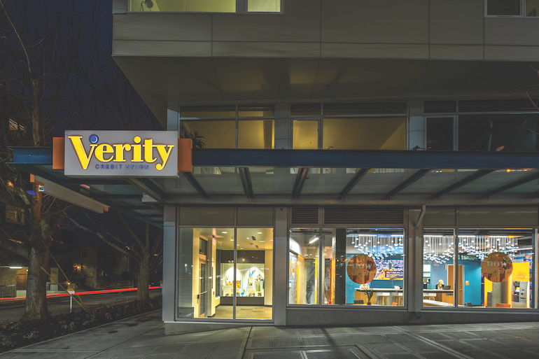
Through this branch, $528 million Verity CU demonstrates its commitment to the historic, art-focused Ballard neighborhood that’s home to many young professionals by showcasing local artists and hosting fundraisers for local charities.
Most Unique Feature
Conversation zones that shift the focus from transactions to more meaningful relationships.
Key Considerations
Verity CU has built its brand around the personalized member experience. With help from Momentum Inc., the CU leveraged this identity into a physical location customized to Ballard residents. The result? A space that looks and feels more like a café than a financial institution.
For mobile-savvy members who prefer online or smartphone transactions, visiting a branch is best left for consultative services, like discussing a home loan. Low transaction volume led to a space dominated by conversation zones, including the café-like area and a counter area reminiscent of an Apple Store Genius Bar. Staff have transitioned from tellers to universal associates who move freely amid the branch, interacting with members in a natural, conversational setting.
The branch environment embodies the atmosphere of Ballard, featuring locally designed murals and an art display showcasing community talent. Day and night, everything is visible from the street through large picture windows. The result is a vibrant billboard of local art and CU culture. Strengthening its cultural roots, the CU also sponsors community events, including pop-up concerts.
Overarching Strategy
Based on a comprehensive market study by Pitney Bowes, the Ballard branch is the second stage of a long-term branching strategy developed by Momentum and Verity CU. Demographic data and predictive analytics projected future performance, while the team developed a list of likely branch locations narrowed down to the neighborhood and intersection level.
Beyond the branch network, the transformation extends to the entire organization. The CU has aligned its delivery channels for a unified omnichannel approach, even creating local web pages for each branch with news about each respective neighborhood. This strategy is embraced throughout the CU, as it breaks down silos for a flatter organizational hierarchy with shifting roles that support evolving member needs.
Fab Facility No. 4
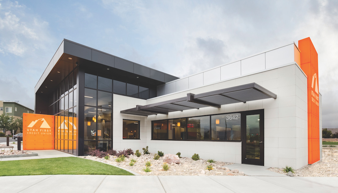
Utah First Federal Credit Union
Melding Iconic Elements and Community
Location: South Jordan, Utah
Builder: DBSI, Chandler, Ariz.
Completion date: July 2017
Square footage: 3,300
Employees: 6
Why Is This Branch Special?
To achieve a complete transformation in banking, delivering an amazing branch design may not always be enough to differentiate. Impacting and fostering change requires a holistic approach and meticulous accounting for every element involved—strategy, design, technology and people.
For $338 million Utah First FCU, this innovative facility delivered all of the above. The vision behind it gave rise to a consistent look and feel for the entire branch network, leveraging similar concepts at every location for supremely consistent branding. The best part? The project was delivered on time and under budget!
Most Unique Feature
Strategic building placement (angled for maximum visibility), tall glass features, illuminated outdoor and digital signage, lighting, and vibrant colors make the location stand out. These brand features attract attention and sell to anyone, 24/7.
Key Considerations
- being visible in an uber-competitive market.
- creating signature elements that align with the Utah First FCU brand, market and members.
- incorporating technology for a high-tech, high-touch environment while increasing efficiencies.
- using the project to develop a scalable kit of parts (detailing protocol, similar to a standard operating procedure) for the branch network.
With defined goals, design and technology decisions for the branch became easy. Open glass windows, building placement, exterior and digital signage, as well as lighting and vibrant colors create a remarkable impact.
The CU’s universal financial experts are supported by teller towers and cash recyclers in an open floor plan enabling collaborative member conversation. Coupled with remote teller software, staff complete transactions from anywhere in the branch—fulfilling a key goal in the CU’s branching strategy.
An “expert nearby” room offers two-way video conferencing and connects members seamlessly with staff.
Product discovery and onboarding are encouraged through digital signage, including a “wow wall,” community board (dedicated to hyper-local content), interactive kiosks and tablets. Staff use these tools in working with members.
Stephanie Schwenn Sebring established and managed the marketing departments for three CUs and served in mentorship roles before launching her business. As owner of Fab Prose & Professional Writing, she assists CUs, industry suppliers, and any company wanting great content and a clear brand voice. Follow her on Twitter @fabprose.


